How the psychology of colour can affect the way in which your business is perceived
You may never have given any thought to the coluor scheme a business chooses to use. No, this isn’t one of those crazy Facebook apps – “What colour is your business? Answer 6 questions and we’ll tell you!” – this is all about the psychology of colour in designs. It is probably more important than you think!
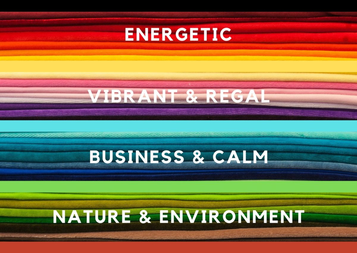
The choice of colour in your logo and website design is vital, and there are common themes across linked business types. For example, the colour blue is used to indicate trustworthiness and technology. Who has blue logos? Dropbox. Twitter. Microsoft now and then. And Big Blue themselves – IBM. It has a calming effect that is great for encouraging a feeling of reliability.
On the other hand, purple suggests royalty and pageantry, while red suggests energy. But there are colour combinations to avoid – black and yellow is a warning from nature (i.e. avoid me! I’m a wasp!) while black and red looks threatening…and is difficult to read.
Even worse is the combination of red and blue – when they are close together it makes it very difficult for your eyes to focus on, and any text becomes very difficult to read. If used as a background for white text, it works better – but just red and blue on their own isn’t often viable for ease of communication.
Green suggests a connection to the natural world, sustainability, and caring for the environment. Orange is vibrant and suggests as much energy as red, but possibly in a more friendly and optimistic way. Yellow is a feel-good color that promotes happiness and creativity.
The best logos work in their original colours and equally as well in monochrome. Extending this to website design, the best websites make it easy to read their content, with sensible color choices and fonts that are the right size to read. Too many moving elements, things flashing on and off, gimmicks of any kind, are all detrimental to getting your message across – and what’s the point of having a website if you can get your message through to people?
Microsoft has used the same style of logo for many years, and it was often seen in blue and white during the 1990s and early 2000s, but it is now commonly seen as simple black text. It is still instantly recognizable as it is the style of the logo that makes the impression – and straight black text gives a sharp and professional image.
Look around you and see what examples of good design you can find – it might be the logo on your TV or a design on your box of cornflakes. The best designs are clear and memorable. Think of the Toyota logo – simple and memorable. As is the Mercedes logo, the Atari logo (another color-changer that is recognized for the shape), the banner at the top of a newspaper, and so on.
A matching logo, website, business card, and everything else is part of your brand, and if people remember your brand, they will remember you and what you offer. If you are instantly forgettable, you will have trouble advertising as people will forget who you are as soon as they have seen you!
So, what colour is your business? Are you blue and reliable? Or red/orange and energetic? Or green and natural?
The colour doesn’t define your business, but your business should define the colour.